Brand strategy, digital experience / 2026
Orbit
A clearer signal in a noisy world.
A clearer signal in a noisy world.
- Positioning and verbal identity01
- Symbol and motion system02
- Research workspace concept03
- Responsive marketing website04
Orbit is a self-initiated concept for a research intelligence platform. The challenge was to make complex information feel navigable without flattening the substance that makes it useful.
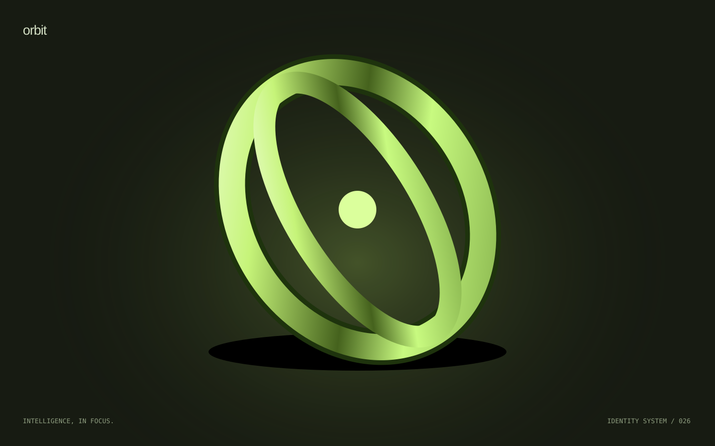
One point of focus. An orbital symbol connects individual discoveries into a larger picture. A bright chartreuse signal cuts through a deep charcoal interface, while an open typographic system gives ideas room to breathe.
012345
&?!→
A clearer signal in a noisy world.
A considered experience that makes room for the things that matter. Designed around a single, clear idea.
Digital experience concept ↗The same idea.
A new dimension.
The digital system translates the identity into an intuitive hierarchy: a clear entry point, useful context, and room to explore. Type, color, and motion create continuity between the brand and the experience.
This concept pairs responsive layouts with readable typography, direct navigation, and reduced-motion support. Each decision is there to make the whole feel more coherent.
Parallel