Give the page a structure.
A grid is a way to make room for difference, not a reason to make everything equal.
The idea
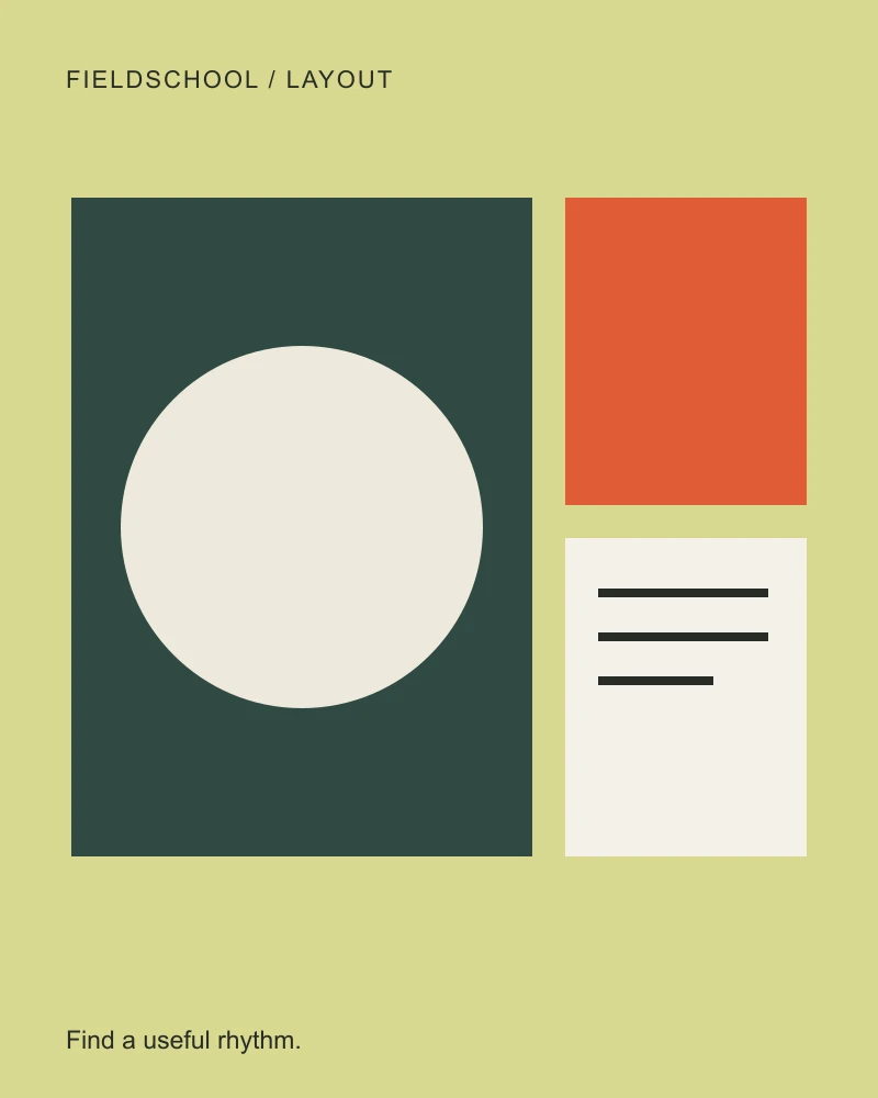
A layout gives different kinds of information different jobs. A large photograph can establish a place while a smaller caption explains why it matters. The relationship is more useful than a row of equally loud cards. Start with three pieces of content: an image, a title, and a note. Change their proportions and ask where your eye goes first.
- Begin with a single strong focal point.
- Choose how supporting items relate to that focal point.
- Test the relationship at a narrow width before adding decoration.
Make a small experiment.
Build an editorial composition with one dominant image and a secondary note. Compare a balanced grid with a two-to-one split. Save a version that still makes sense in the narrow preview.
An observation
Room for the unexpected.
A simple structure lets the important things find their place. Begin with a shape, a title, and a little breathing room.
Keep the thinking.
What became more important when the columns changed? Does the mobile order preserve the same story?